Reinventing QuickBooks

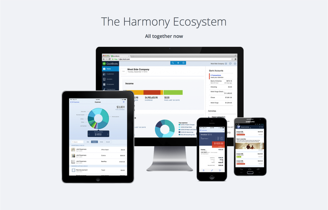
QuickBooks Online has been in existence for over 10 years.  Initially ahead of its time, the product became antiquated and complex.  As the product approached the 500k user mark, we realized we would need to rebuild the product from scratch in order to scale for the future.  In August of 2013 I was given the opportunity to partner with the developer and product lead to redesign QuickBooks online end-to-end using HTML5 and CSS3.  Our goal was to optimize for new users, to make the product usable on tablet devices, and to modernize the application so that it looked consistent across devices and within the application.  

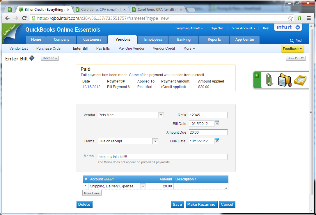
QuickBooks before the redesign:


We started by creating a set of design principles: 

  1. Be simple, easy to use, and guiding.

  2. Design for the customer and instill confidence.

  3. Establish modern and iconic ownable moments.

  4. Celebrate data while respecting user and device context.

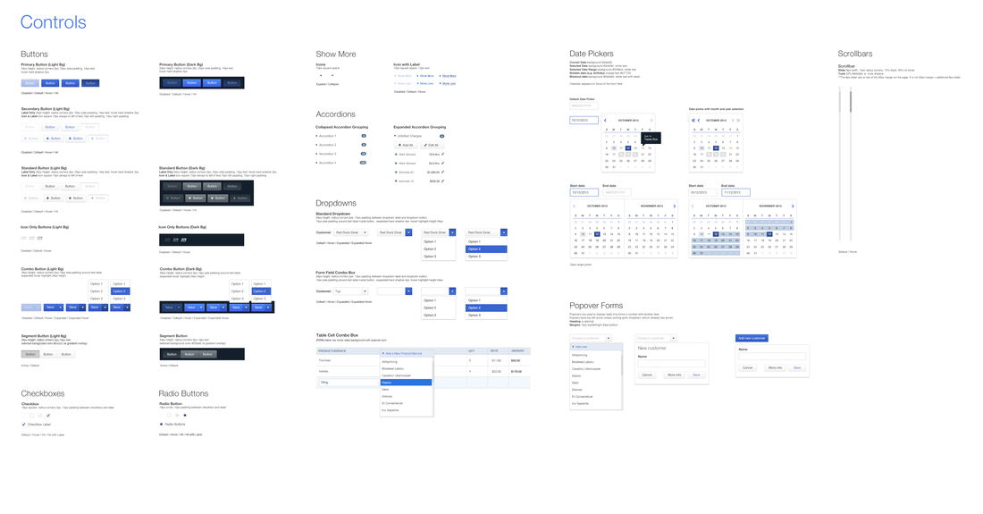
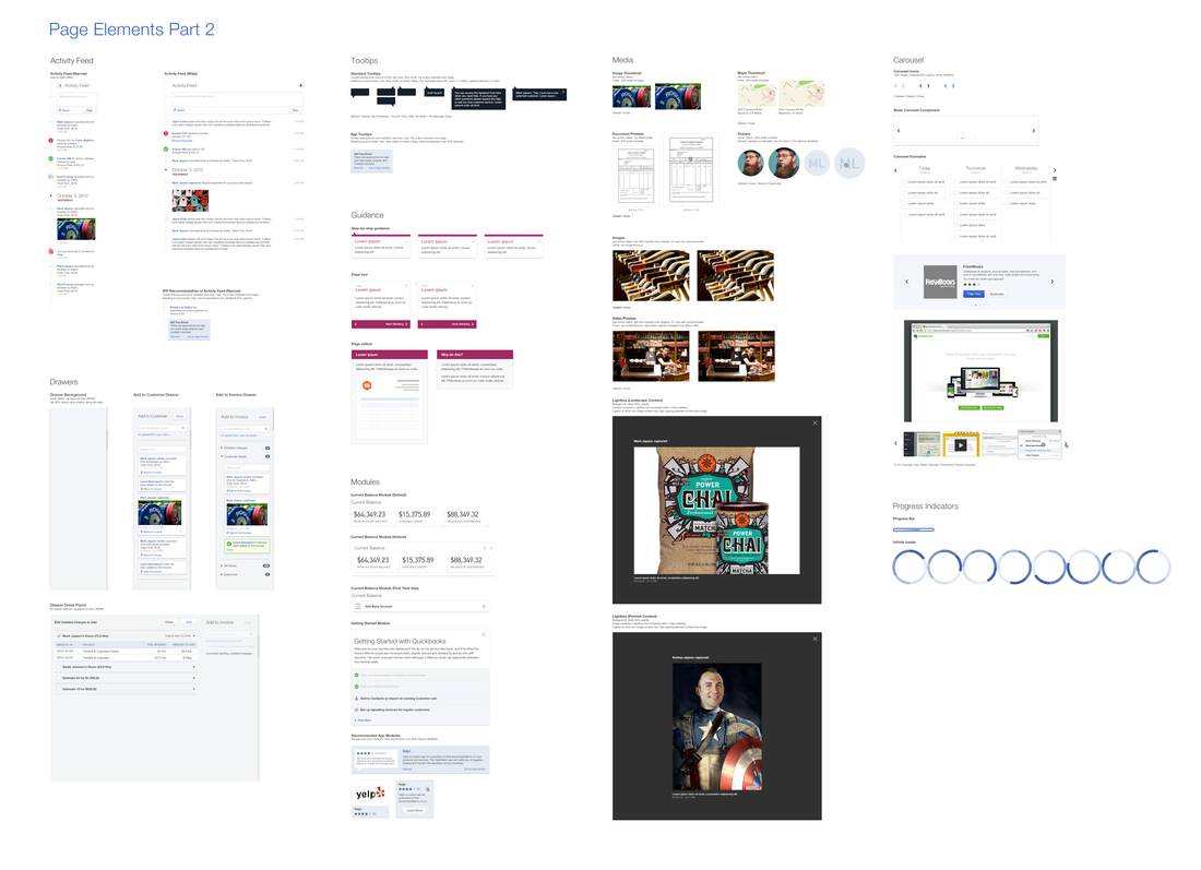
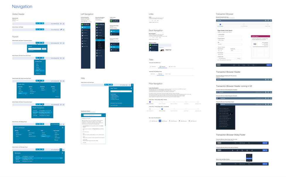
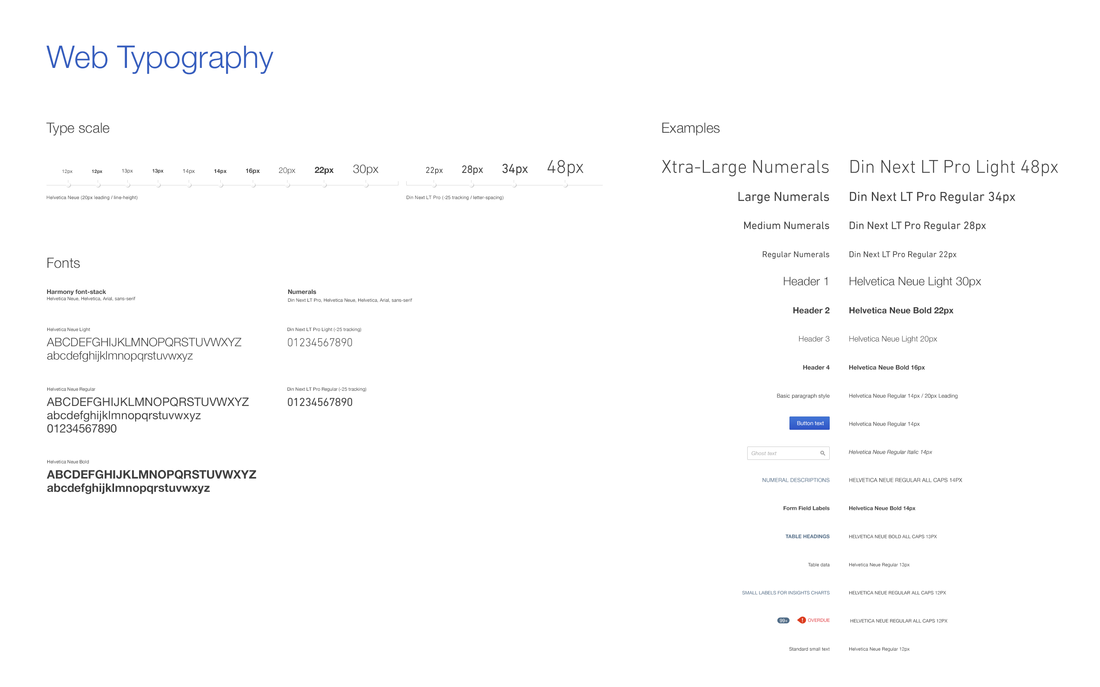
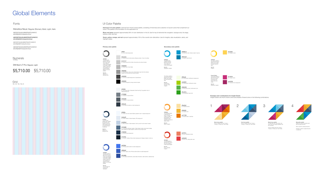
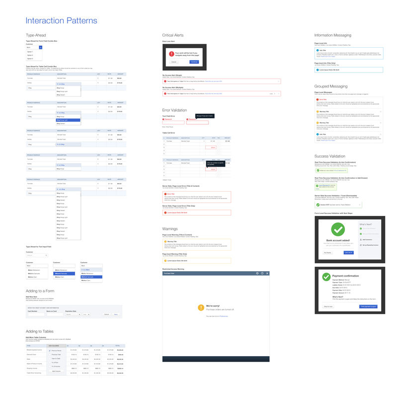
We created a design language system that supported those principles.

We then applied the design language system to the product.

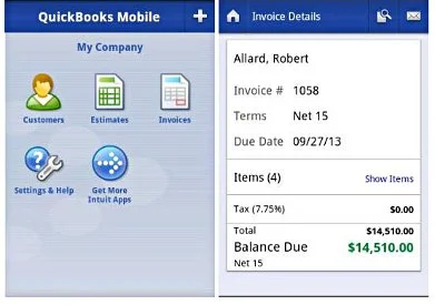
We simplified the existing IA and navigation structure from 72 navigation items down to 8.  We created iconic moments in our first use experience, and in the ongoing product experience.  New users witness us customizing the product for them based on their industry and location.  Ongoing users can access or create new transactions from anywhere in the application.  We developed mobile patterns to align with our web design language system, so that we have a consistent experience end-to-end, and across devices. 

We focused narrowly on a few ownable and iconic moments in the user experience.

- TRANSACTION BROWSER
- GLOBAL CREATE
- FIRST USE EXPERIENCE